
Rebel & You -
FMCG Brand & Product Launch
UX, Branding, Customer Experience
Sector: FMCG
Role: Brand & Experience Designer
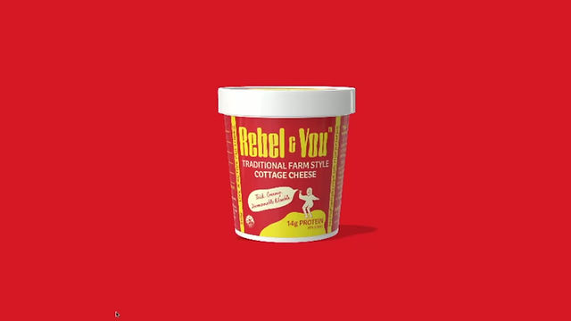
Rebel & You is a New Zealand FMCG brand launched to challenge conventional perceptions of cottage cheese through a clean, modern and no-nonsense approach to both product and brand.
The project focused on shaping an end-to-end brand and product experience spanning strategy, identity, packaging and retail interaction, with a strong emphasis on how customers discover, interpret and navigate products within physical retail environments.

[ The Problem ]
The cottage cheese category is often characterised by low differentiation, dated branding and unclear product positioning. Within crowded retail environments, customers are required to make rapid purchasing decisions using limited visual cues to distinguish between products. This frequently results in low brand recognition, weak emotional connection and uncertainty at the point of purchase.
The challenge was to design a brand and product experience that could communicate value quickly, stand out within a saturated category and support faster, more confident purchasing decisions through clarity, simplicity and transparency.
[ Discovery & Research ]
Working closely with the founder, research focused on understanding customer behaviour, category conventions and opportunities for differentiation within the FMCG landscape. This included in-store observation of shopper behaviour, competitor and category analysis, review of packaging systems and exploration of positioning opportunities across the category.
Insights from both consumer strategy and behavioural research informed the broader brand and product experience, shaping how customers discover, interpret and navigate the product across packaging, retail and digital touchpoints. Particular focus was placed on how purchasing decisions are made within crowded retail environments, where customers often rely on rapid visual recognition and limited information at shelf.
[ Key Insights ]
Research revealed several consistent behavioural patterns:
-
Purchasing decisions were made rapidly: Customers relied heavily on immediate visual recognition and simplified messaging rather than detailed product evaluation.
-
Category fatigue reduced differentiation: Repetitive packaging systems and similar messaging created confusion and limited brand distinction at shelf.
-
Clarity built trust: Simple, direct communication felt more credible and approachable than overly complex or heavily stylised branding approaches.
These insights informed a brand and packaging system designed to feel distinctive, immediately recognisable and easy to navigate within a crowded retail environment.
[ Design Strategy ]
The design strategy focused on creating a brand and product experience centred around clarity, recognition and rapid decision-making within crowded retail environments. Packaging was approached as a decision-making interface - designed to simplify product navigation, improve shelf visibility and communicate value quickly through bold visual hierarchy and direct messaging.
A simplified “no B.S.” positioning informed both the tone of voice and broader brand system, reducing unnecessary complexity and creating a more approachable, recognisable customer experience across packaging, retail and digital touchpoints.
To differentiate the brand within a visually muted category, a bold red and yellow palette was introduced to increase shelf visibility and stimulate stronger appetite and attention cues commonly associated with fast-food and FMCG environments. This helped position the product as more contemporary, craveable and visually disruptive within the category.


[ Brand & Experience Design ]
The final output established a scalable brand and product system spanning identity, packaging, tone of voice and digital touchpoints. Packaging was designed to function as both brand expression and retail interface, using strong hierarchy, simplified messaging and bold visual cues to support rapid product recognition and decision-making at shelf.
A flexible character and iconography system was developed to strengthen brand recognition across packaging, campaigns, social content and future product extensions. Inspired by the founder’s optimistic personality, the visual language balanced playfulness with clarity while remaining adaptable across evolving FMCG categories and customer touchpoints.
The system also incorporated custom emoji and graphic iconography informed by Gen Z communication behaviours and digital culture, helping create a more conversational, culturally relevant brand experience across marketing and social channels. Throughout the project, emphasis was placed on maintaining consistency across physical and digital touchpoints while supporting future product expansion within the wider Rebel & You brand ecosystem.


[ Product Design ]
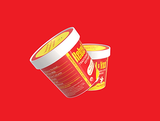
The project established a complete brand and product system spanning identity, packaging, tone of voice and digital touchpoints. Packaging was designed to optimise shelf visibility, simplify product navigation and support rapid decision-making through clear hierarchy and direct communication.
Packaging was treated as a key interaction point - functioning as both brand expression and retail interface within the customer experience. Design decisions were informed by how customers move through aisles, scan products and make purchasing decisions within fast-paced retail environments, ensuring the system balanced usability, recognition and brand impact.
.png)
.png)
.png)
[ Outcome ]